
Re-defining
Checkout Experience
Many beautiful and unique shops are offering their costumers the option of buying their products online, but not all are making the experience easy enough.
There are a lot of reasons for a client to abandon his shopping cart without purchasing anything. It could be a complicated registration process, a risky or unreliable feeling, a long and confusing buying process. Ciudadano Grant is a beautiful book store in Madrid in which I had a long and confusing online shopping experience. Here are some suggestions on how to improve it.
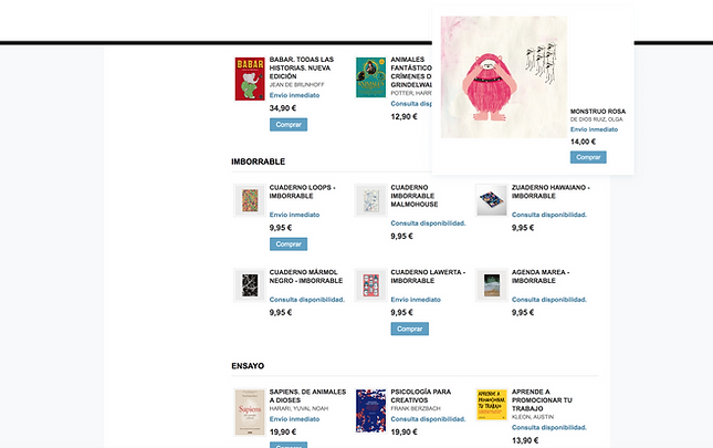
I was looking to buy these beautiful children's book Monstrou Rosa.
After adding it to my shopping cart, I got a subtle confirmation.
It was successfully added to my cart.
When hovering the cart symbol on the top of the page I could get a quick look at my items, including some important information such as title, image, quantity, and price.
I could also delete it directly from it, without entering the cart page.

When entering the shopping cart, the client's first decisions are the payment method and the shipping destination.
The overview is important, so the client can see his order details.

The choice of isolating the shipping costs from the rest of the order suppose to help clients decide if they want to continue shopping despite the extra costs. But it's also a bit confusing and misplaced.
Some of the options are clear, but for the ones that are not, like International G1-4, there's no explanation added.


The next step, after reviewing the cart content, is shipping and payment details. If the user has already registered once, he can use his email and password to continue.
But if it’s the user’s first time buying on this page, he’ll have to fill in a form, and create a user account.

I've also noticed that when the user makes mistakes while filling the form, pop-ups are showing up on the screen to inform him where the mistake was made.
After the user closes the pop-up, there’s no visual indication to which input field needs to be corrected.

If there's more then one field to correct, it will show up as another pop-up only after the first one has been corrected.


Login and Registration Flow
The user path can be less time-consuming by allowing social media and/or guest registration, alongside sign in and creating a new account.

Client Address
The client address for shipping and billing can be added in the next step, along with the shipping extra costs and payment method.

Pop-ups and Errors
Emphasizing the input fields that need correction can free the user from remembering the pop-up content.
Seeing clearly the fields that need to be edited makes the process easier and quicker to understand.
